
Adobe Analytics Dashboard
Goal
Improve user engagement and conversion by identifying UX drop-offs and behaviour patterns
Role
Adobe Analytics
Role
Analytics Project Lead
Timeline
March 2025
🎯 Why We Initiated This
We noticed that the Travel Insurance journey had one of the highest drop-offs across all products — especially at the proposal and payment stages. Despite strong quote-stage traffic, few users converted. To identify what exactly was going wrong, we initiated a structured UX analytics deep-dive — aiming to move beyond gut-feel heuristics and base decisions on quantifiable user behaviors.
This report was created as a design team-led initiative, bridging data with UX empathy. It empowered us to not just fix flows reactively, but also proactively craft experiments with measurable intent.
🧩 Structure & Framework
We followed a modular diagnostic model, inspired by HEART and customized for insurance journeys, covering:
- Acquisition & Entry Behavior
Which channels or landing pages bring users in? Are they aligned with intent? - Engagement & Hesitation Metrics
How long do users pause before key actions? What’s their scroll/click behavior? - Journey Progression (Funnel Mapping)
Where exactly do users drop off, and at what stage do friction points intensify? - Segment & Device Breakdown
Are different cohorts (e.g., mobile users, older users, repeat visitors) facing unique issues?
This gave us a scalable template that both product and design teams could reuse across journeys to extract UX insights from behavioral data — not just traffic numbers.
📊 Key UX Dimensions & Metrics Tracked
🚀 What We Aimed to Achieve
Our goal was to:
- Pinpoint friction points at each critical step (quote, proposal, payment)
- Understand user hesitation through behavior metrics like “time prior to event”
- Validate design hypotheses around trust, content hierarchy, and visibility
- Provide a reusable analytics blueprint that informs both short-term fixes and long-term experiments
This gave us a scalable template that both product and design teams could reuse across journeys to extract UX insights from behavioral data — not just traffic numbers.
🌍 Application Across Other LOBs
The same framework was adopted by:
- Motor Insurance — to analyze IDV slider usage and policy detail engagement
- Health Insurance — to track policy comparisons and mobile drop-offs
- PA & Home — to identify scroll gaps, CTA visibility, and compare conversion by coverage type
Teams could plug in their own journey-specific events while retaining the same core diagnostic panels, enabling a shared language of UX measurement across products.
🔬 What’s Next: Experiments Ahead
Based on the insights, the design team proposed a series of low-to-medium fidelity experiments:
- Inline nudges during proposal stage to explain terms and reduce hesitation
- Split Quote Form A/B: One-page vs multi-step for mobile users
- Sticky CTAs & Mobile-first Reordering for quote and add-on selection screens
- Trust Amplifiers (IRDAI info, trip protection details) surfaced early for first-time visitors
- Inline Validations to prevent dead-end errors and reduce frustration
Upcoming releases will test these in sprints, with outcomes measured via VWO and this same analytics dashboard.
Chandra Kumar Deo
Adobe Analytics Dashboard
Goal:
Improve user engagement and conversion by identifying UX drop-offs and behaviour patterns
Tool Used:
Adobe Analytics
Role:
Analytics Project Lead
Timeline:
March 2025

🎯 Why We Initiated This
We noticed that the Travel Insurance journey had one of the highest drop-offs across all products — especially at the proposal and payment stages. Despite strong quote-stage traffic, few users converted. To identify what exactly was going wrong, we initiated a structured UX analytics deep-dive — aiming to move beyond gut-feel heuristics and base decisions on quantifiable user behaviors.
This report was created as a design team-led initiative, bridging data with UX empathy. It empowered us to not just fix flows reactively, but also proactively craft experiments with measurable intent.
🧩 Structure & Framework
We followed a modular diagnostic model, inspired by HEART and customized for insurance journeys, covering:
- Acquisition & Entry Behavior
Which channels or landing pages bring users in? Are they aligned with intent? - Engagement & Hesitation Metrics
How long do users pause before key actions? What’s their scroll/click behavior? - Journey Progression (Funnel Mapping)
Where exactly do users drop off, and at what stage do friction points intensify? - Segment & Device Breakdown
Are different cohorts (e.g., mobile users, older users, repeat visitors) facing unique issues?
This gave us a scalable template that both product and design teams could reuse across journeys to extract UX insights from behavioral data — not just traffic numbers.
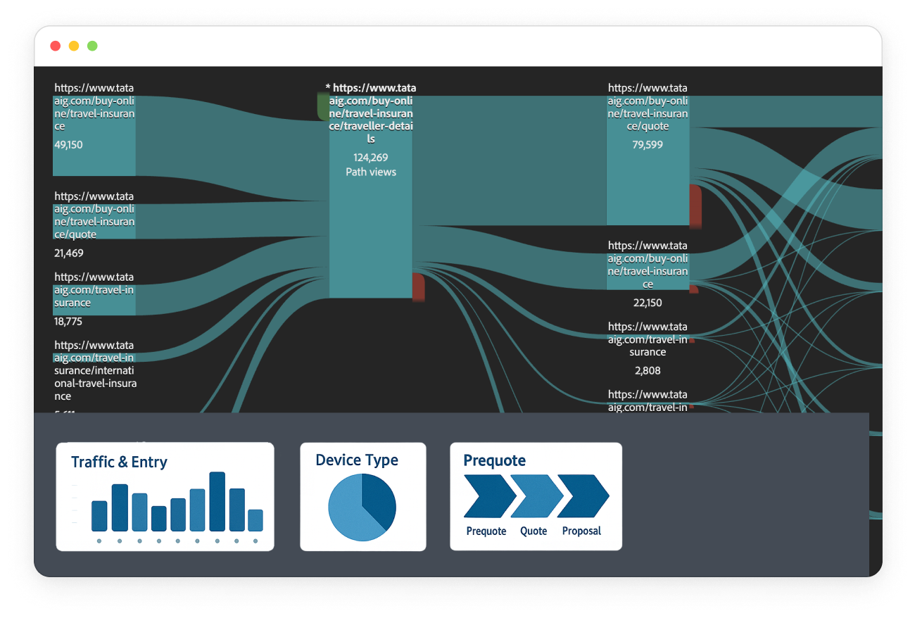
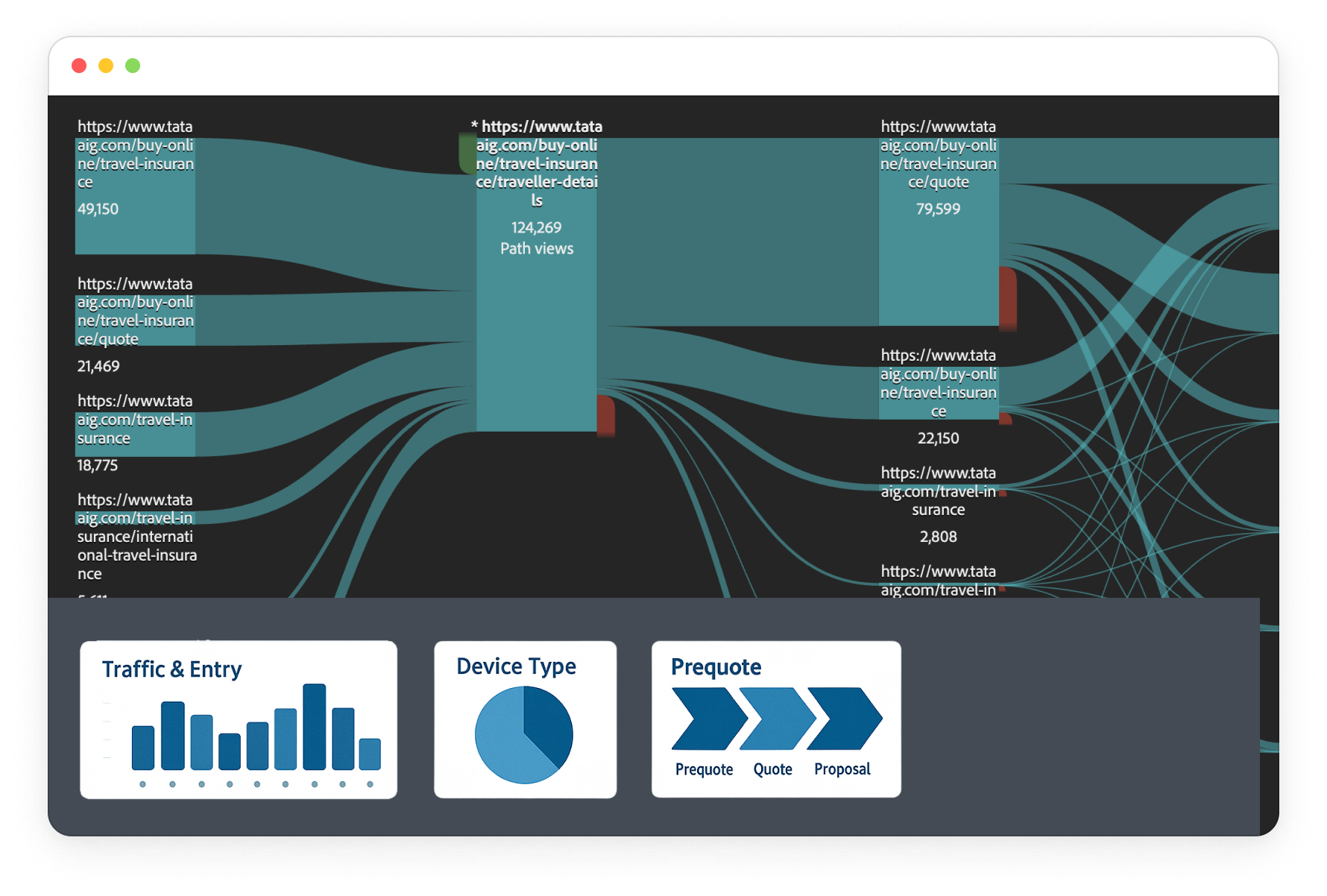
📊 Key UX Dimensions & Metrics Tracked
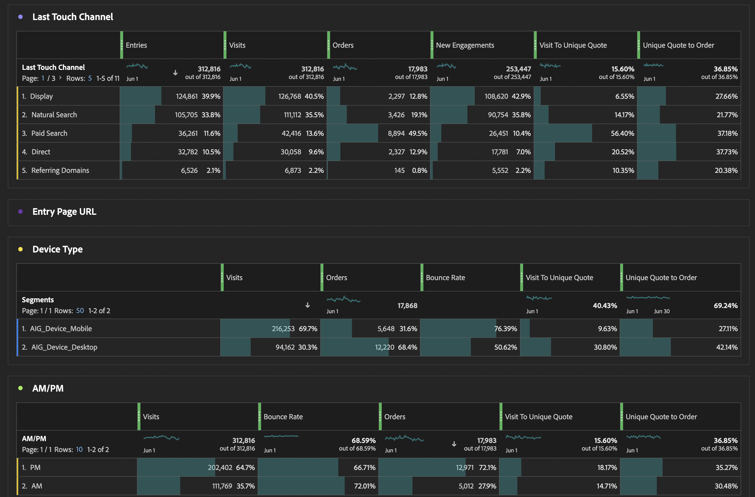

Traffic & Entry

Where users land & bounce?
We analyzed first/last touch channels, entry pages, and bounce rates. Paid Search had the highest bounce (~58%), highlighting misaligned user intent and poor landing page relevance.
Are users interacting or hesitating?
Key metrics like Time Prior to Event, Scroll Depth, and Visit Duration showed strong intent at the quote stage but hesitation before submitting forms — especially on mobile.
Where are users dropping off, and why?
By mapping Quote → Proposal → Payment → Thank You, we identified proposal stage as the biggest drop zone. Key causes: long forms, unclear add-ons, and no real-time validations.
Which users struggle the most?
Older users (60+) and mobile users showed higher drop-off. Loyal customers converted better than new ones. This helped us plan segment-specific UI tweaks and trust reinforcements.
Does trip type or group size impact conversion?
More travelers and longer durations correlated with higher form fatigue. Group trips (3+) showed lower conversion, indicating a need for form simplification and better summary visibility.
🚀 What We Aimed to Achieve
Our goal was to:
- Pinpoint friction points at each critical step (quote, proposal, payment)
- Understand user hesitation through behavior metrics like “time prior to event”
- Validate design hypotheses around trust, content hierarchy, and visibility
- Provide a reusable analytics blueprint that informs both short-term fixes and long-term experiments
This gave us a scalable template that both product and design teams could reuse across journeys to extract UX insights from behavioral data — not just traffic numbers.
🌍 Application Across Other LOBs
The same framework was adopted by:
- Motor Insurance — to analyze IDV slider usage and policy detail engagement
- Health Insurance — to track policy comparisons and mobile drop-offs
- PA & Home — to identify scroll gaps, CTA visibility, and compare conversion by coverage type
Teams could plug in their own journey-specific events while retaining the same core diagnostic panels, enabling a shared language of UX measurement across products.
🔬 What’s Next: Experiments Ahead
Based on the insights, the design team proposed a series of low-to-medium fidelity experiments:
- Inline nudges during proposal stage to explain terms and reduce hesitation
- Split Quote Form A/B: One-page vs multi-step for mobile users
- Sticky CTAs & Mobile-first Reordering for quote and add-on selection screens
- Trust Amplifiers (IRDAI info, trip protection details) surfaced early for first-time visitors
- Inline Validations to prevent dead-end errors and reduce frustration
Upcoming releases will test these in sprints, with outcomes measured via VWO and this same analytics dashboard.

Adobe Analytics Dashboard
Goal:
Improve user engagement and conversion by identifying UX drop-offs and behaviour patterns
Tool Used:
Adobe Analytics
Role:
Analytics Project Lead
Timeline:
March 2025
🎯 Why We Initiated This
We noticed that the Travel Insurance journey had one of the highest drop-offs across all products — especially at the proposal and payment stages. Despite strong quote-stage traffic, few users converted. To identify what exactly was going wrong, we initiated a structured UX analytics deep-dive — aiming to move beyond gut-feel heuristics and base decisions on quantifiable user behaviors.
This report was created as a design team-led initiative, bridging data with UX empathy. It empowered us to not just fix flows reactively, but also proactively craft experiments with measurable intent.
🧩 Structure & Framework
We followed a modular diagnostic model, inspired by HEART and customized for insurance journeys, covering:
- Acquisition & Entry Behavior
Which channels or landing pages bring users in? Are they aligned with intent? - Engagement & Hesitation Metrics
How long do users pause before key actions? What’s their scroll/click behavior? - Journey Progression (Funnel Mapping)
Where exactly do users drop off, and at what stage do friction points intensify? - Segment & Device Breakdown
Are different cohorts (e.g., mobile users, older users, repeat visitors) facing unique issues?
This gave us a scalable template that both product and design teams could reuse across journeys to extract UX insights from behavioral data — not just traffic numbers.
📊 Key UX Dimensions & Metrics Tracked
Traffic & Entry
Where users land & bounce?
We analyzed first/last touch channels, entry pages, and bounce rates. Paid Search had the highest bounce (~58%), highlighting misaligned user intent and poor landing page relevance.
Are users interacting or hesitating?
Key metrics like Time Prior to Event, Scroll Depth, and Visit Duration showed strong intent at the quote stage but hesitation before submitting forms — especially on mobile.
Where are users dropping off, and why?
By mapping Quote → Proposal → Payment → Thank You, we identified proposal stage as the biggest drop zone. Key causes: long forms, unclear add-ons, and no real-time validations.
Which users struggle the most?
Older users (60+) and mobile users showed higher drop-off. Loyal customers converted better than new ones. This helped us plan segment-specific UI tweaks and trust reinforcements.
Does trip type or group size impact conversion?
More travelers and longer durations correlated with higher form fatigue. Group trips (3+) showed lower conversion, indicating a need for form simplification and better summary visibility.
🚀 What We Aimed to Achieve
Our goal was to:
- Pinpoint friction points at each critical step (quote, proposal, payment)
- Understand user hesitation through behavior metrics like “time prior to event”
- Validate design hypotheses around trust, content hierarchy, and visibility
- Provide a reusable analytics blueprint that informs both short-term fixes and long-term experiments
This gave us a scalable template that both product and design teams could reuse across journeys to extract UX insights from behavioral data — not just traffic numbers.
🌍 Application Across Other LOBs
The same framework was adopted by:
- Motor Insurance — to analyze IDV slider usage and policy detail engagement
- Health Insurance — to track policy comparisons and mobile drop-offs
- PA & Home — to identify scroll gaps, CTA visibility, and compare conversion by coverage type
Teams could plug in their own journey-specific events while retaining the same core diagnostic panels, enabling a shared language of UX measurement across products.
🔬 What’s Next: Experiments Ahead
Based on the insights, the design team proposed a series of low-to-medium fidelity experiments:
- Inline nudges during proposal stage to explain terms and reduce hesitation
- Split Quote Form A/B: One-page vs multi-step for mobile users
- Sticky CTAs & Mobile-first Reordering for quote and add-on selection screens
- Trust Amplifiers (IRDAI info, trip protection details) surfaced early for first-time visitors
- Inline Validations to prevent dead-end errors and reduce frustration
Upcoming releases will test these in sprints, with outcomes measured via VWO and this same analytics dashboard.