Health Insurance
Goal
Redesign the health insurance journey to reduce drop-offs and improve quote conversion rates.
Role
UX & UI Designer
Role
TATA AIG
Timeline
Oct 2024 – May 2025
🧩 Overview
India’s health insurance market is complex, with high user drop-offs and low trust in digital journeys. This project focused on rethinking the purchase experience — making it simpler, more human, and guided.
Impace I Brought
✔️ Created a more intuitive, intent-driven flow
✔️ Improved quote page engagement
✔️ Reduced user anxiety around form-filling
🔍 The Problem
So here’s the problem . . .
Despite a functional flow, the health insurance journey suffered from:
- High drop-offs before quote generation.
- User confusion around complex insurance terminology.
- A lack of decision support during plan selection.
“Users don’t understand the product, feel lost in the flow, and drop off before getting to the quote.”

Process being followed
Initial Insights

- Stakeholder Inputs
- Problem Statement
UX Research
- Existing design analysis
- Competitive Analysis
- Direct Interviews
Ideation & Feedback
- Wire-framing MVP
- Stakeholder Feedback
- Technical Feasibility Check
Design & Testing
- UI Design
- Internal Review
- Stakeholder Review
- Usability Testing
- Dev Handover

Iterations
Post-launch
🧠 Research Approach
Initial Insights

Adobe Analytics
Users were exiting at CKYC and communication steps.

Focus Group Discussions
Users felt overwhelmed by jargon and long forms.

Competitor Check
Platforms like ACKO and Lemonade offered simplified flows and real-time help.
Usability Check
Conducted usability testing with Care Insurance; Also, compared with Acko, Care, Argo, Lombard, +4.
Insights
- Testing: High Drop-offs at Data-Heavy or Sensitive Steps; Lack of Guidance Hampers Decision-Making
- Competitive analysis: Live chat, user education, & reducing cognitive load.

Visible in desktop mode
Direct User Interviews
Conducted 1:1 sessions with 8 potential buyers (18–34 yrs, Tier 1 & 2 cities).
Insights
- Unclear policy language and lack of trust.
- Highlighting the value of human support in building trust and clarity during the purchase journey.
💡 Ideation & MVP
Inspired by global UX leaders like Lemonade and Insurify.
Introduced TIA
TIA (Chatbot) was introduced to serve as a smart, supportive companion along the journey—offering pre-defined guidance, exactly when users need it.
Intent-Based Journeys
Intent-based paths—some wants to explore, others compare, and a few ready to buy, ensures each user gets relevant content, pacing, and support
Simplified Pre-Quote Inputs
To reduce friction and mental overload, the pre-quote process was restructured into bite-sized, sequential steps—making it feel faster, clearer, and easier to complete.
Enhanced Quote Page
Improved the quote page for better comprehension, easier comparison, and clearer feature distinctions.
Next Step . . .

Wire-framing MVP
After analyzing user pain points, we drew inspiration from user-centric foreign websites like Lemonade, Insurify, and Ladder Life. Our POC focused on 4 key areas.


Stakeholder Feedback
Presented MVP wireframes to Product Managers and key stakeholders for initial feedback and alignment.

Technical Feasibility Check
Collaborated with the development team to evaluate the feasibility of proposed features and flows.
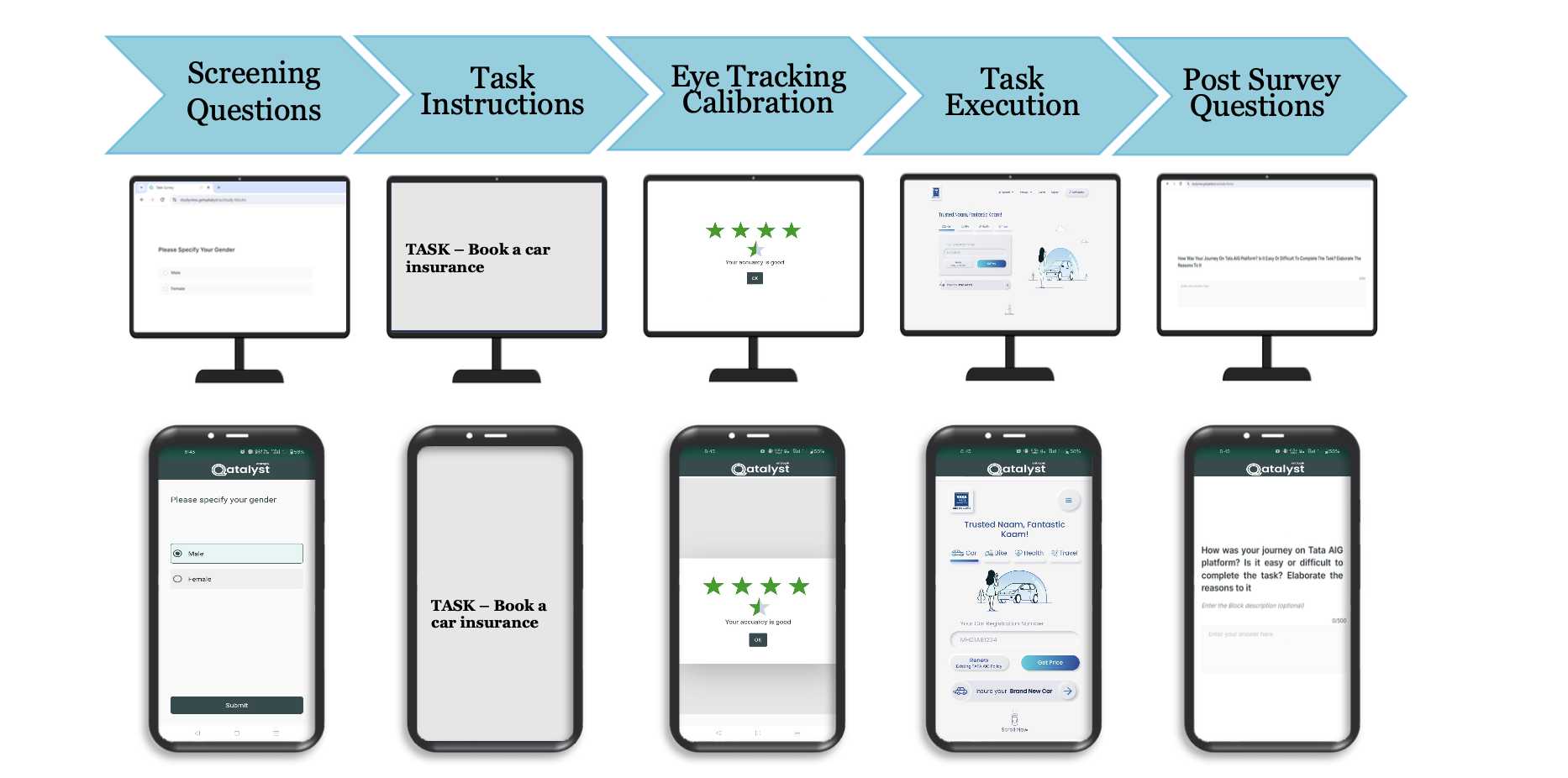
🧪 Design + Testing
Usability Testing (8 users):
- Desktop (6), Mobile (2)
- Feedback on navigation, data privacy, and comparison friction
🔧 Improvements Made
Nominee/Member edits unclear
Clarified with icons and labels
Confusing flow
Added progress bar and back buttons
Plan comparison hard
Simplified UI with clear hierarchy & videos
Privacy anxiety
Added micro-copy and delay personal data entry
✨ Before → After
Visible in desktop mode
📈 Post-launch Validation

Quantitative Metrics
Tracks user behavior at scale — drop-offs, time spent, click-throughs, conversion rates — to establish baseline performance and surface friction points.
Qualitative Feedback
Provides heatmaps, scroll tracking, session replays, and quick surveys to capture how users interact with the new journey and where attention or confusion lies.

Behavioral Validation
Live 1:1 sessions will help us understand user mindset, navigation ease, and clarity of plan comprehension — validating the design at a human level.
Chandra Kumar Deo
Health Insurance
Redesign the health insurance journey to reduce drop-offs and improve quote conversion rates.
Role:
UX & UI Designer
Client:
TATA AIG
Timeline:
Oct 2024 – May 2025
🧩 Overview
India’s health insurance market is complex, with high user drop-offs and low trust in digital journeys. This project focused on rethinking the purchase experience — making it simpler, more human, and guided.
Impace I Brought
✔️ Created a more intuitive, intent-driven flow
✔️ Improved quote page engagement
✔️ Reduced user anxiety around form-filling
🔍 The Problem
So here’s the problem . . .
Despite a functional flow, the health insurance journey suffered from:
- High drop-offs before quote generation.
- User confusion around complex insurance terminology.
- A lack of decision support during plan selection.
“Users don’t understand the product, feel lost in the flow, and drop off before getting to the quote.”
Process being followed
Initial Insights
- Stakeholder Inputs
- Problem Statement
UX Research
- Existing design analysis
- Competitive Analysis
- Direct Interviews
Ideation & Feedback
- Wire-framing MVP
- Stakeholder Feedback
- Technical Feasibility Check
Design & Testing
- UI Design
- Internal Review
- Stakeholder Review
- Usability Testing
- Dev Handover
Iterations
Post-launch
🧠 Research Approach
Initial Insights
Adobe Analytics
Users were exiting at CKYC and communication steps.
Focus Group Discussions
Users felt overwhelmed by jargon and long forms.
Competitor Check
Platforms like ACKO and Lemonade offered simplified flows and real-time help.
Usability Check
Conducted usability testing with Care Insurance; Also, compared with Acko, Care, Argo, Lombard, +4.
Insights
- Testing: High Drop-offs at Data-Heavy or Sensitive Steps; Lack of Guidance Hampers Decision-Making
- Competitive analysis: Live chat, user education, & reducing cognitive load.

Research Flow

Direct User Interviews
Conducted 1:1 sessions with 8 potential buyers (18–34 yrs, Tier 1 & 2 cities).
Insights
- Unclear policy language and lack of trust.
- Highlighting the value of human support in building trust and clarity during the purchase journey.
💡 Ideation & MVP
Inspired by global UX leaders like Lemonade and Insurify.
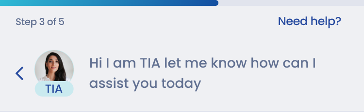
Introduced TIA
TIA (Chatbot) was introduced to serve as a smart, supportive companion along the journey—offering pre-defined guidance, exactly when users need it.
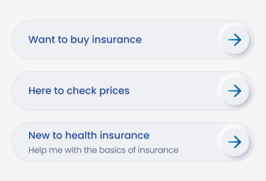
Intent-Based Journeys
Intent-based paths—some wants to explore, others compare, and a few ready to buy, ensures each user gets relevant content, pacing, and support
Simplified Pre-Quote Inputs
To reduce friction and mental overload, the pre-quote process was restructured into bite-sized, sequential steps—making it feel faster, clearer, and easier to complete.
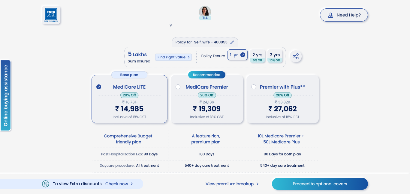
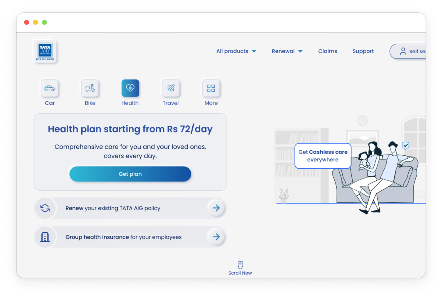
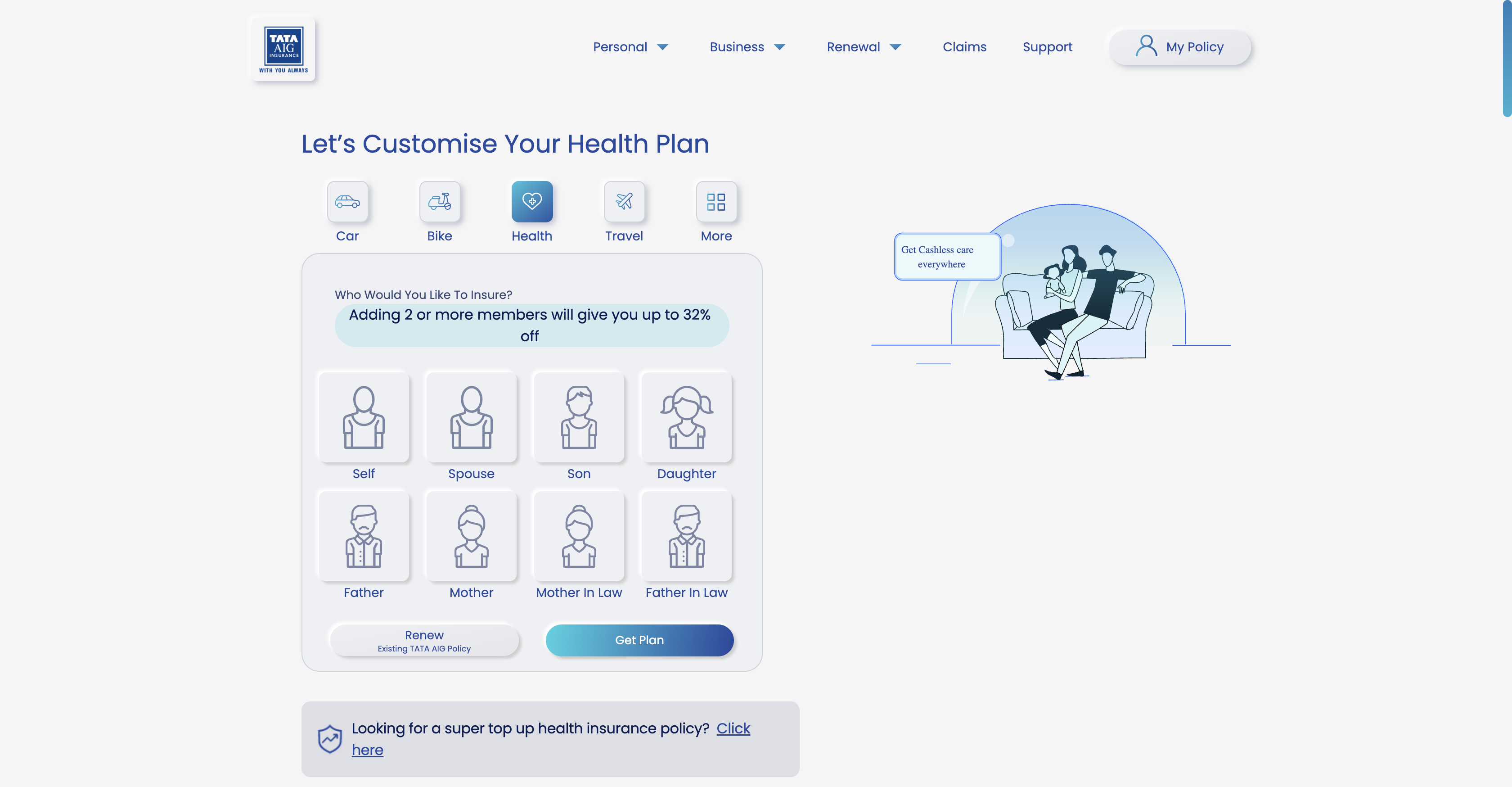
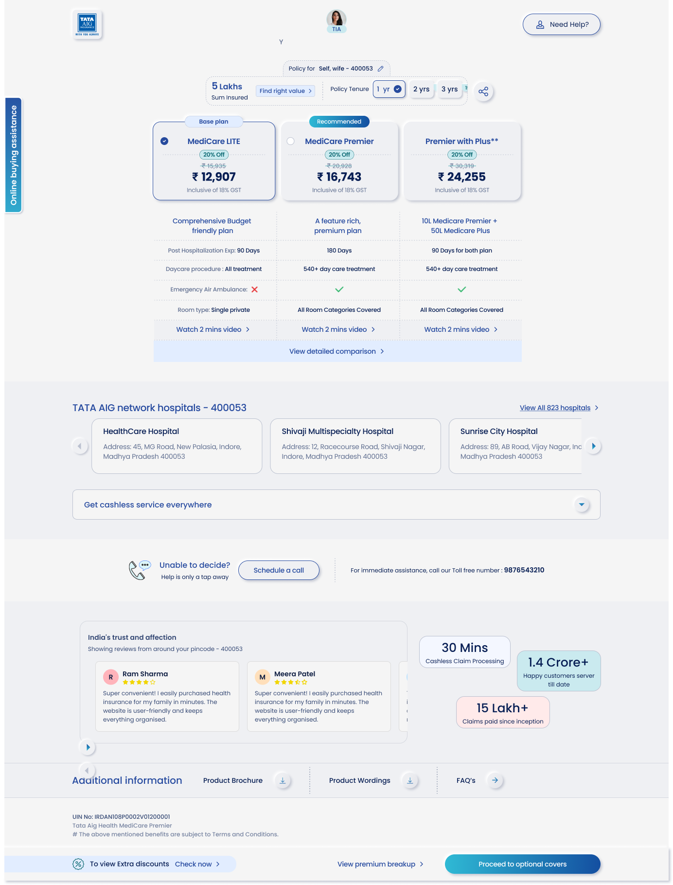
Enhanced Quote Page
Improved the quote page for better comprehension, easier comparison, and clearer feature distinctions.
Next Step . . .
Wire-framing MVP
After analyzing user pain points, we drew inspiration from user-centric foreign websites like Lemonade, Insurify, and Ladder Life. Our POC focused on 4 key areas.
Stakeholder Feedback
Presented MVP wireframes to Product Managers and key stakeholders for initial feedback and alignment.
Technical Feasibility Check
Collaborated with the development team to evaluate the feasibility of proposed features and flows.
🧪 Design + Testing
Usability Testing (8 users):
- Desktop (6), Mobile (2)
- Feedback on navigation, data privacy, and comparison friction
🔧 Improvements Made
Nominee/Member edits unclear
Clarified with icons and labels
Confusing flow
Added progress bar and back buttons
Plan comparison hard
Simplified UI with clear hierarchy & videos
Privacy anxiety
Added micro-copy and delay personal data entry
✨ Before → After

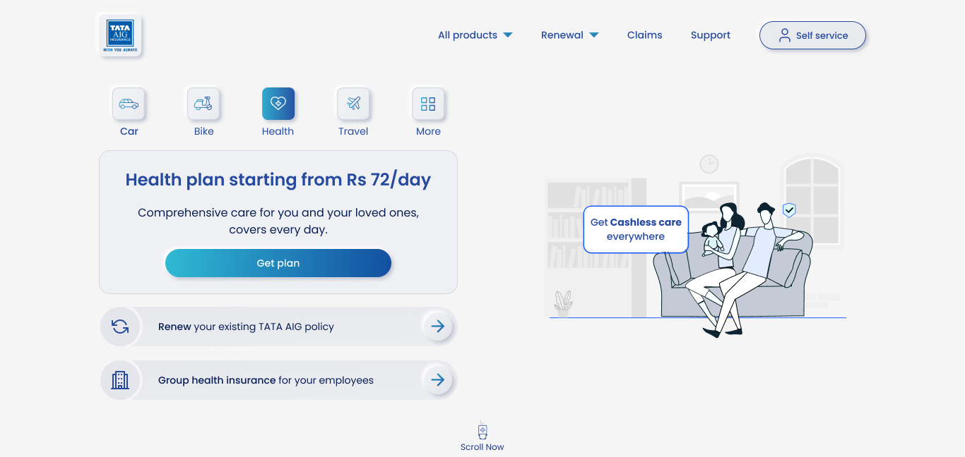
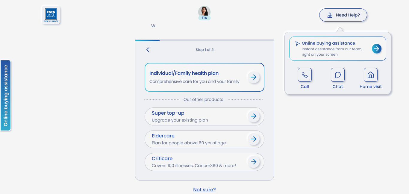
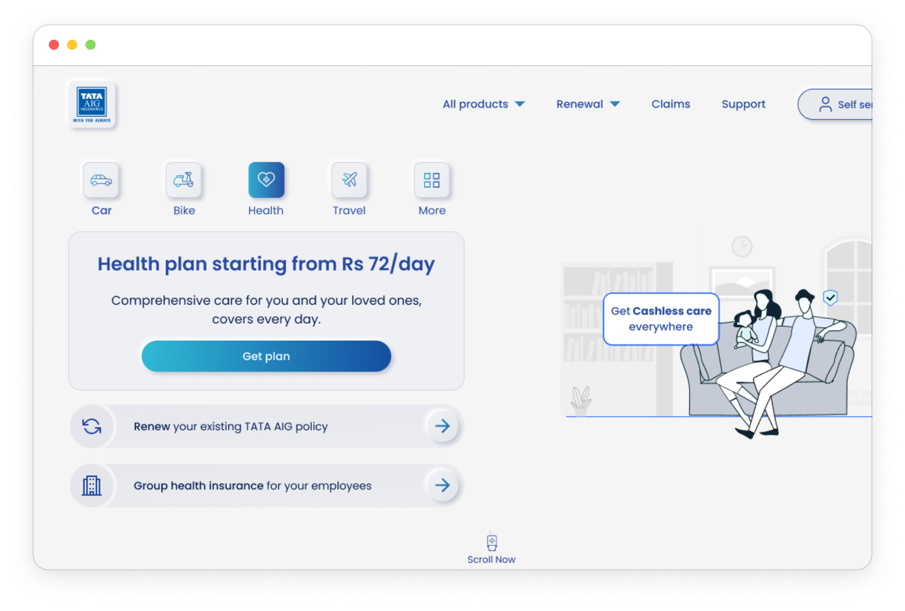
❌ Journey started without understanding user intent

✅ Primary CTA clearly highlighted

❌ Multiple CTAs caused decision fatigue

✅ Simplified screen with focused actions
❌ Member selection forced upfront

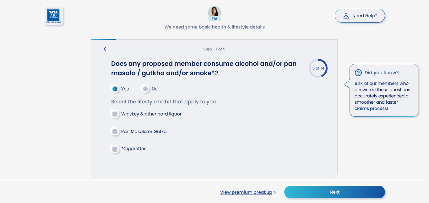
✅ Clear support options via TIA and help panel
✅ Guided, step-by-step journey introduced

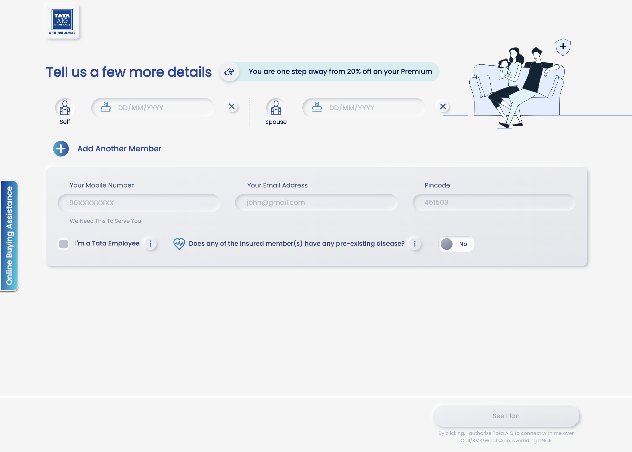
❌ Cluttered screen with too many input fields upfront
❌ Overwhelming form-like experience
✅ Intent-based entry with plan type upfront
✅ Cleaner layout with primary action and visual hierarchy
✅ Plans simplified with clear naming and key benefits upfront
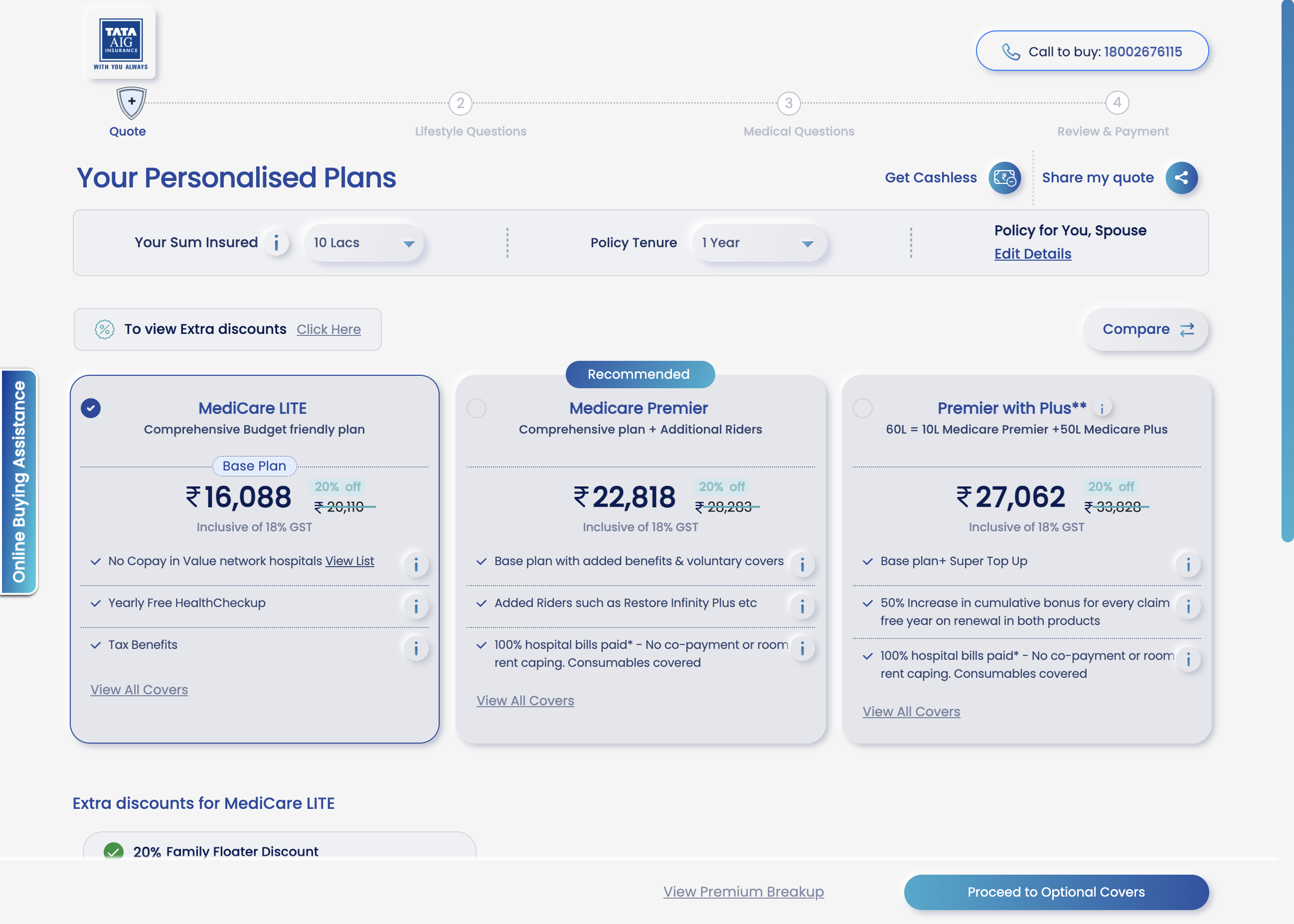
❌ Premium info scattered and visually heavy
❌ Overloaded UI with multiple CTAs (e.g., “Compare”, “Proceed”, “View All Covers”)
✅ Added short explainer videos and focused comparison options
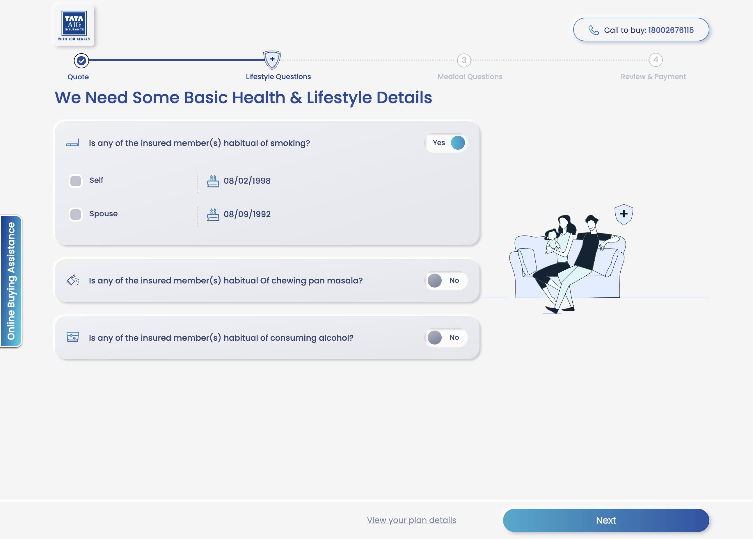
✅ Progress indicator added to show journey stage
✅ Plans simplified with clear naming and key benefits upfront
❌ Multiple questions at once increase make it overwhelming for the users
❌ Overloaded UI with multiple CTAs (e.g., “Compare”, “Proceed”, “View All Covers”)
✅ Contextual help icon with reassurance messaging (e.g., claim accuracy stat)

Visit Page
[1/4]
📈 Post-launch Validation
Quantitative Metrics
Tracks user behavior at scale — drop-offs, time spent, click-throughs, conversion rates — to establish baseline performance and surface friction points.
Qualitative Feedback
Provides heatmaps, scroll tracking, session replays, and quick surveys to capture how users interact with the new journey and where attention or confusion lies.
Behavioral Validation
Live 1:1 sessions will help us understand user mindset, navigation ease, and clarity of plan comprehension — validating the design at a human level.

Health Insurance
Goal:
Redesign the health insurance journey to reduce drop-offs and improve quote conversion rates.
Role:
UX & UI Designer
Client:
TATA AIG
Timeline:
Oct 2024 – May 2025
🧩 Overview
India’s health insurance market is complex, with high user drop-offs and low trust in digital journeys. This project focused on rethinking the purchase experience — making it simpler, more human, and guided.
Impace I Brought
✔️ Created a more intuitive, intent-driven flow
✔️ Improved quote page engagement
✔️ Reduced user anxiety around form-filling
🔍 The Problem
So here’s the problem . . .
Despite a functional flow, the health insurance journey suffered from:
- High drop-offs before quote generation.
- User confusion around complex insurance terminology.
- A lack of decision support during plan selection.
“Users don’t understand the product, feel lost in the flow, and drop off before getting to the quote.”
Process being followed
Initial Insights
- Stakeholder Inputs
- Problem Statement
UX Research
- Existing design analysis
- Competitive Analysis
- Direct Interviews
Ideation & Feedback
- Wire-framing MVP
- Stakeholder Feedback
- Technical Feasibility Check
Design & Testing
- UI Design
- Internal Review
- Stakeholder Review
- Usability Testing
- Dev Handover
Iterations
Post-launch
🧠 Research Approach
Initial Insights
Adobe Analytics
Users were exiting at CKYC and communication steps.
Focus Group Discussions
Users felt overwhelmed by jargon and long forms.
Competitor Check
Platforms like ACKO and Lemonade offered simplified flows and real-time help.
Usability Check
Conducted usability testing with Care Insurance; Also, compared with Acko, Care, Argo, Lombard, +4.
Insights
- Testing: High Drop-offs at Data-Heavy or Sensitive Steps; Lack of Guidance Hampers Decision-Making
- Competitive analysis: Live chat, user education, & reducing cognitive load.
Research Flow
Direct User Interviews
Conducted 1:1 sessions with 8 potential buyers (18–34 yrs, Tier 1 & 2 cities).
Insights
- Unclear policy language and lack of trust.
- Highlighting the value of human support in building trust and clarity during the purchase journey.
💡 Ideation & MVP
Inspired by global UX leaders like Lemonade and Insurify.
Introduced TIA
TIA (Chatbot) was introduced to serve as a smart, supportive companion along the journey—offering pre-defined guidance, exactly when users need it.
Intent-Based Journeys
Intent-based paths—some wants to explore, others compare, and a few ready to buy, ensures each user gets relevant content, pacing, and support
Simplified Pre-Quote Inputs
To reduce friction and mental overload, the pre-quote process was restructured into bite-sized, sequential steps—making it feel faster, clearer, and easier to complete.
Enhanced Quote Page
Improved the quote page for better comprehension, easier comparison, and clearer feature distinctions.
Next Step . . .
Wire-framing MVP
After analyzing user pain points, we drew inspiration from user-centric foreign websites like Lemonade, Insurify, and Ladder Life. Our POC focused on 4 key areas.
Stakeholder Feedback
Presented MVP wireframes to Product Managers and key stakeholders for initial feedback and alignment.
Technical Feasibility Check
Collaborated with the development team to evaluate the feasibility of proposed features and flows.
🧪 Design + Testing
Usability Testing (8 users):
- Desktop (6), Mobile (2)
- Feedback on navigation, data privacy, and comparison friction
🔧 Improvements Made
Nominee/Member edits unclear
Clarified with icons and labels
Confusing flow
Added progress bar and back buttons
Plan comparison hard
Simplified UI with clear hierarchy & videos
Privacy anxiety
Added micro-copy and delay personal data entry
✨ Before → After
❌ Journey started without understanding user intent
✅ Primary CTA clearly highlighted
❌ Multiple CTAs caused decision fatigue
✅ Simplified screen with focused actions
❌ Member selection forced upfront
✅ Clear support options via TIA and help panel
✅ Guided, step-by-step journey introduced
❌ Cluttered screen with too many input fields upfront
❌ Overwhelming form-like experience
✅ Intent-based entry with plan type upfront
✅ Cleaner layout with primary action and visual hierarchy
✅ Plans simplified with clear naming and key benefits upfront
❌ Premium info scattered and visually heavy
❌ Overloaded UI with multiple CTAs (e.g., “Compare”, “Proceed”, “View All Covers”)
✅ Added short explainer videos and focused comparison options
✅ Progress indicator added to show journey stage
❌ Multiple questions at once increase make it overwhelming for the users
❌ Overloaded UI with multiple CTAs (e.g., “Compare”, “Proceed”, “View All Covers”)
✅ Contextual help icon with reassurance messaging (e.g., claim accuracy stat)
Visit Page
📈 Post-launch Validation
Quantitative Metrics
Tracks user behavior at scale — drop-offs, time spent, click-throughs, conversion rates — to establish baseline performance and surface friction points.
Qualitative Feedback
Provides heatmaps, scroll tracking, session replays, and quick surveys to capture how users interact with the new journey and where attention or confusion lies.
Behavioral Validation
Live 1:1 sessions will help us understand user mindset, navigation ease, and clarity of plan comprehension — validating the design at a human level.