
ISO - Research
Goal
Tasked with enhancing engagement and driving conversions for the various yoga programs, products, and content available
Role
Figma, Google Analytics, Whimsical
Role
UX Researcher
Timeline
Sep 2023 - Jan 2024
About the Project
In 2016, ISO became the primary website for Isha Foundation, serving as a comprehensive platform to highlight the organization's offerings. Tasked with enhancing engagement and driving conversions for the various yoga programs, products, and content available, my focus was on the "Wisdom" section, which serves as the content hub of the parent site.
🔍 Problem with Current ISO Wisdom!
The current iteration of isha.sadhguru.org (ISO) was created to present a comprehensive display of all the offerings of the organization. It was designed with a straightforward approach, featuring linear information architecture, a non-hierarchical layout, and no prioritization due to a lack of supporting data.`
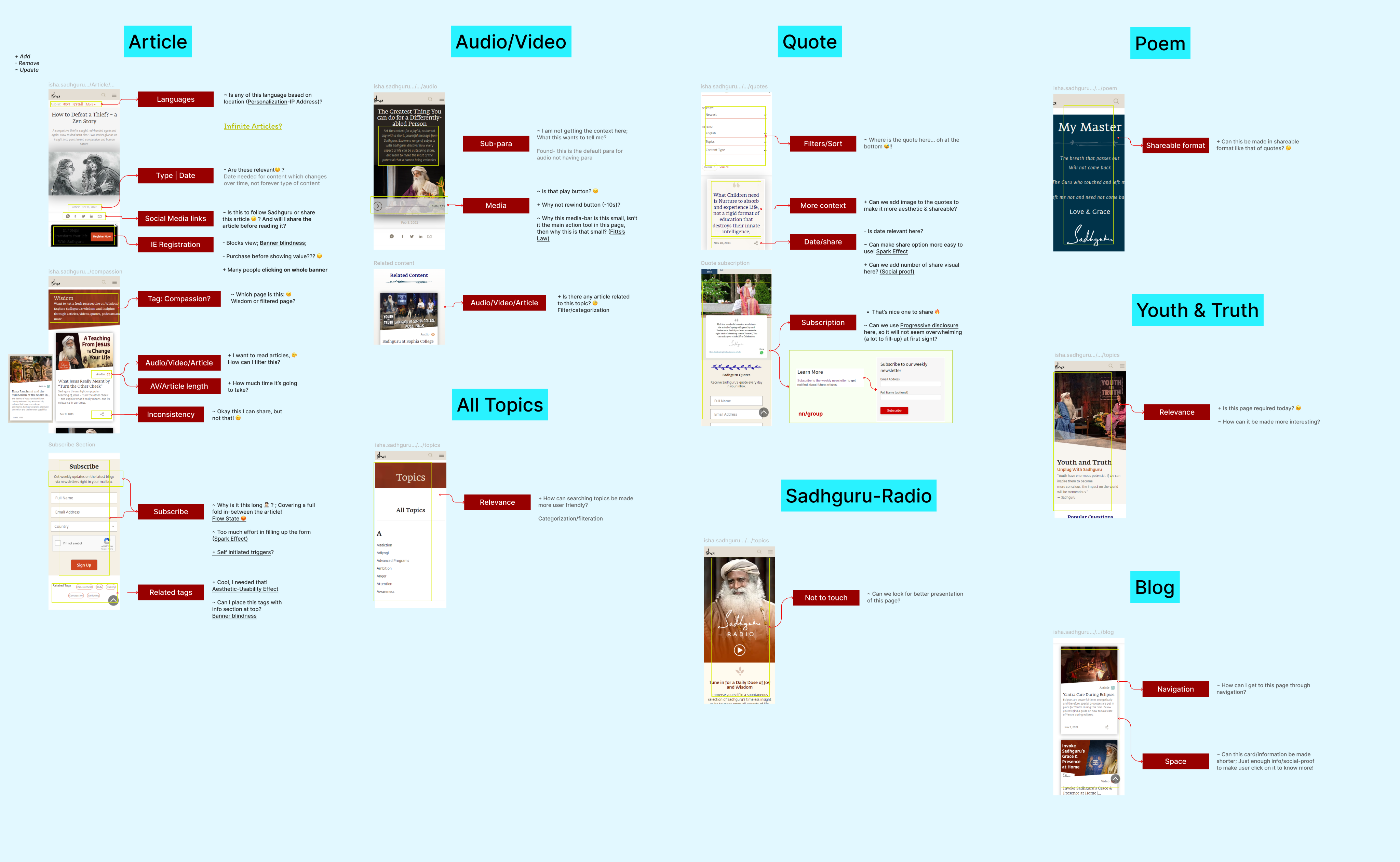
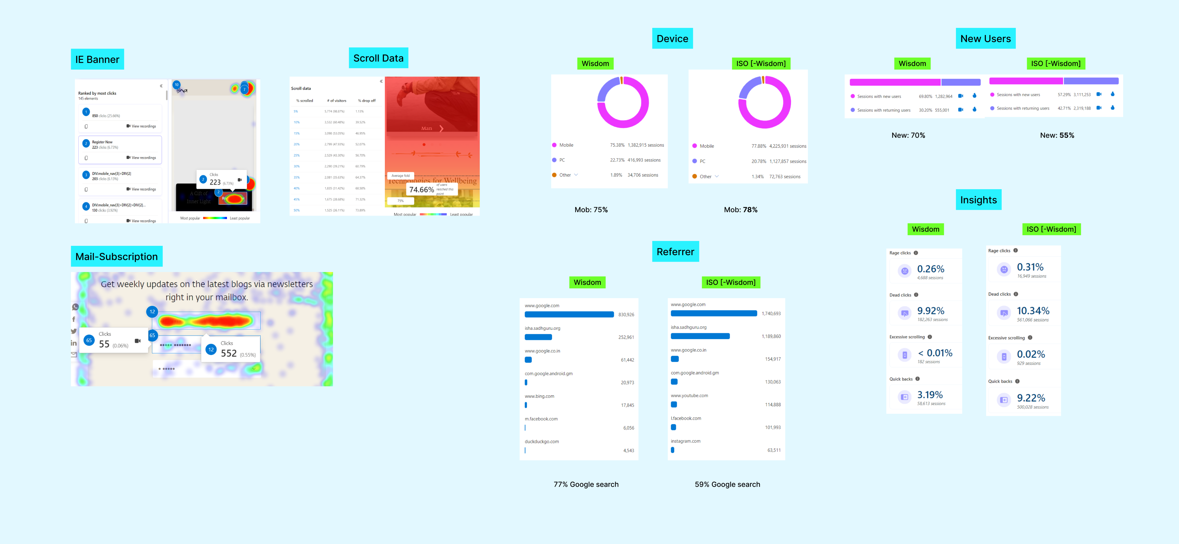
To start, I conducted a thorough UX audit of the entire ISO Wisdom platform. This involved analyzing the site's architecture, page layout, and identifying the factors influencing its low engagement. Delving into the quantitative data of the website provided a wealth of valuable insights.
Factors Resulting in
✔️ Over 90% of users exit after only reading the first article when arriving from Google Search.
✔️ Users face limited navigation options, including post-article navigation, easy content filtration, nudges, and access to metadata.
✔️ Content types such as blogs and popular topics like story-based or darker content suffer from poor discoverability.
Further Exploration with User Journey Mapping
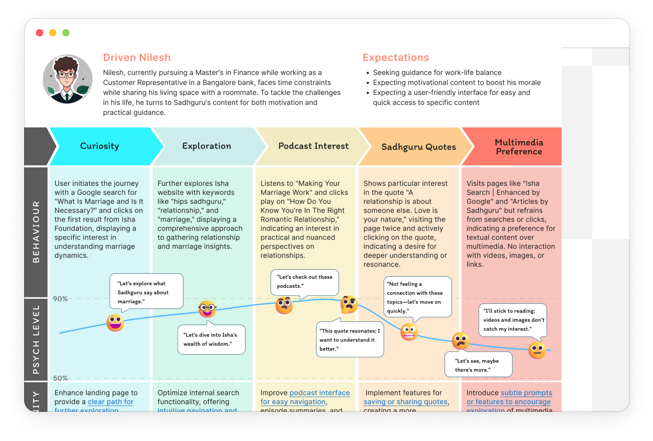
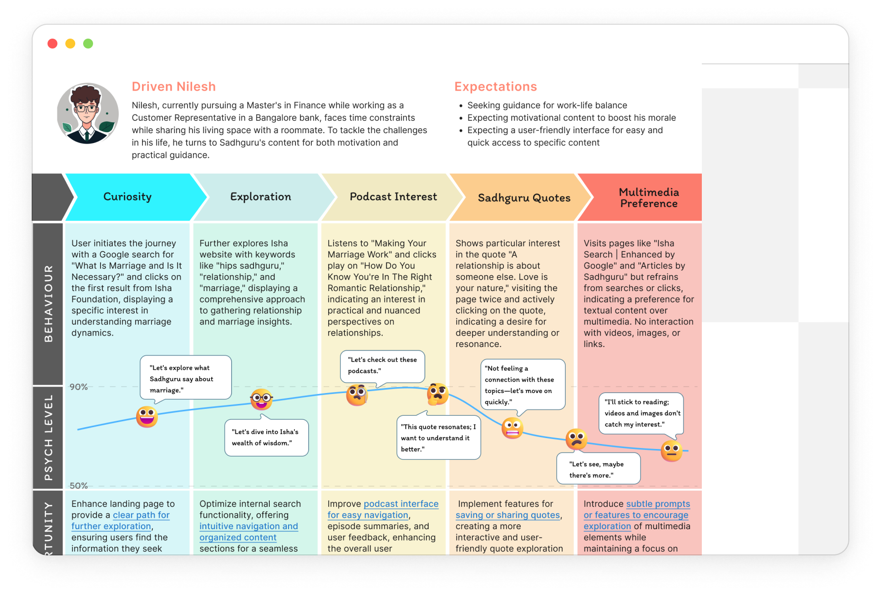
Using quantitative data from MS Clarity, I discerned three distinct personas characterized by variations in age, referral sources, and needs. Leveraging user recordings, I delved deeper into understanding user behaviors and interactions with the platform.
💡 Ideation & MVP
I then proceeded to analyze each possible user flow meticulously, aiming to identify both problems and opportunities at every turn and corner of the platform. At this point, I was having complete understanding of the problems with ISO wisdom.
Discoverability – Information Architecture & Navigations
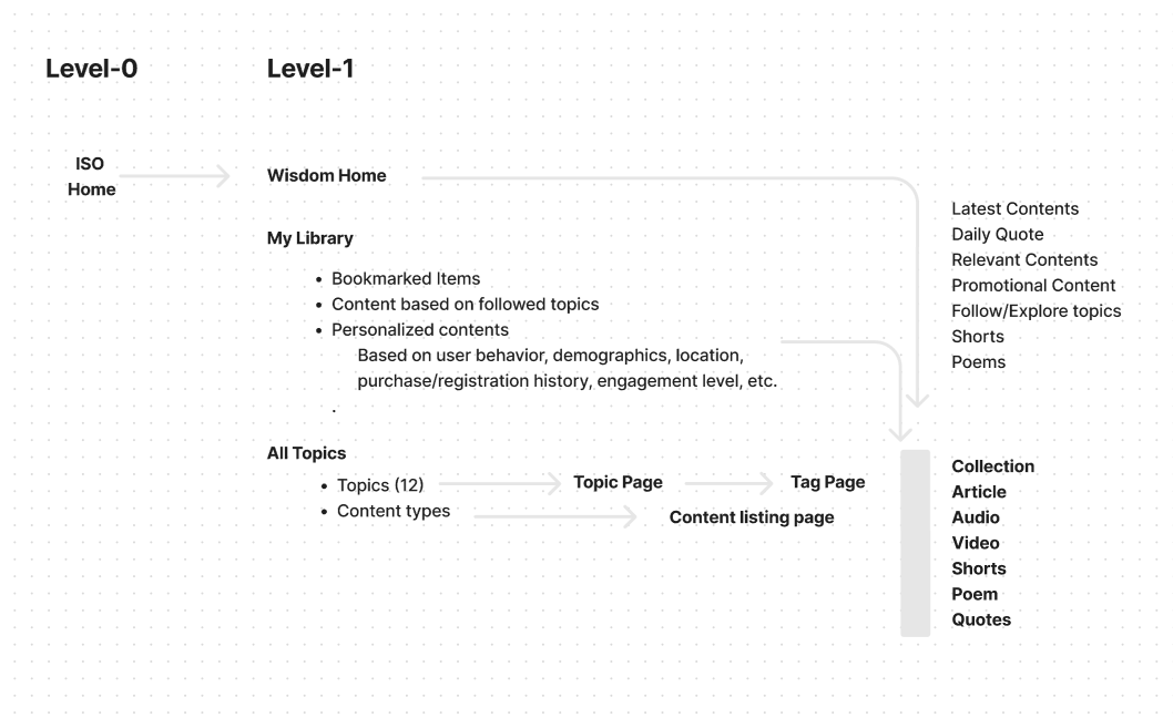
The client's primary requirement is for users to effortlessly explore and navigate through the contents of the site. We began by drawing inspiration from the organization's app Information Architecture (IA), which divides the entire content into 12 distinct topics.
Engagement – Collections and New Features
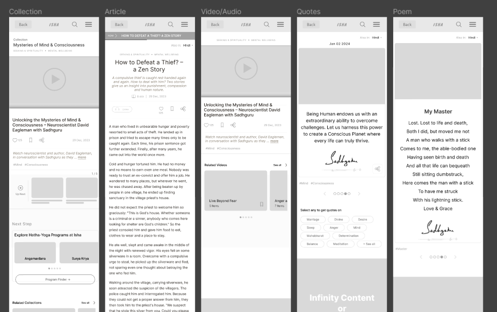
During our user research, we discovered that the average active time users spent on Wisdom was only 2.4 minutes. To boost this engagement, we concentrated on specific content types, particularly collections, articles, videos, and quotes. Since collections were the focal point for user engagement in the mobile app, we aimed to replicate this structure on the website as well.
Conversion – Pool of Linked Components
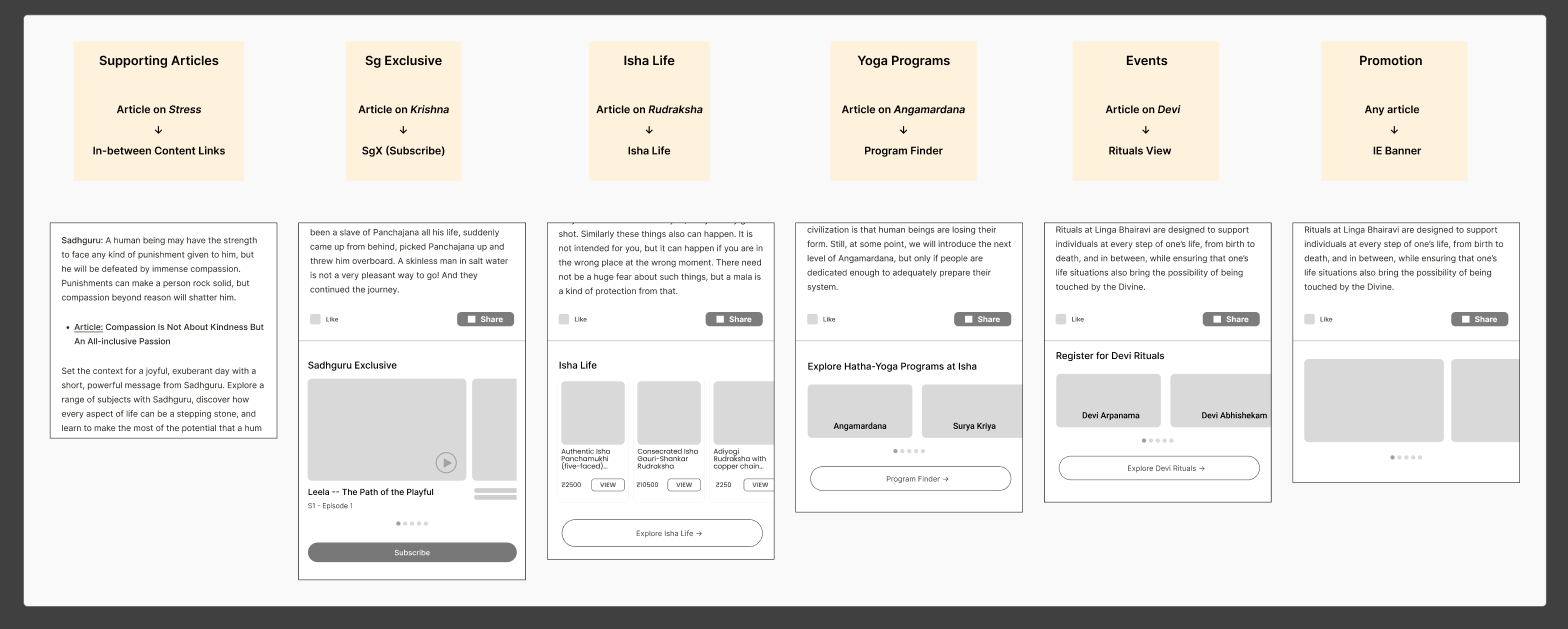
The ultimate objective of the Wisdom section is to guide users towards registering for yoga programs or events, purchasing Isha products, or subscribing to Sadhguru Exclusive, among other conversion actions.
Retention – My Library
Approximately 70% of the daily users on Wisdom are new users, and one of our objectives was to encourage these users to revisit the platform. One approach to achieve this was to introduce user profiles. For guest users, we limit the number of items they can view in collections. Additionally, we are committed to delivering curated content lists tailored to each user's preferences. This customization is based on factors such as search and purchase history, followed topics, demographics, and more.
What I Learned?
Things that I inculcate in my design process:
- Organizing UX Data: Structured data analysis revealed user behaviors, guiding insights for intuitive design enhancements.
- Primary Noun Architecture: Utilized primary nouns for streamlined content organization, simplifying navigation and enhancing user experience.
- Quantitative Data's Value: Analyzing metrics provided actionable insights, aiding informed design decisions for user-centric solutions.
Chandra Kumar Deo
ISO - Research
Goal:
Tasked with enhancing engagement and driving conversions for the various yoga programs, products, and content available
Tool Used:
Figma, Google Analytics, Whimsical
Role:
UX Researcher
Timeline:
Sep 2023 - Jan 2024

About the Project
In 2016, ISO became the primary website for Isha Foundation, serving as a comprehensive platform to highlight the organization's offerings. Tasked with enhancing engagement and driving conversions for the various yoga programs, products, and content available, my focus was on the "Wisdom" section, which serves as the content hub of the parent site.
🔍 Problem with Current ISO Wisdom!
The current iteration of isha.sadhguru.org (ISO) was created to present a comprehensive display of all the offerings of the organization. It was designed with a straightforward approach, featuring linear information architecture, a non-hierarchical layout, and no prioritization due to a lack of supporting data.`
To start, I conducted a thorough UX audit of the entire ISO Wisdom platform. This involved analyzing the site's architecture, page layout, and identifying the factors influencing its low engagement. Delving into the quantitative data of the website provided a wealth of valuable insights.
Factors Resulting in
✔️ Over 90% of users exit after only reading the first article when arriving from Google Search.
✔️ Users face limited navigation options, including post-article navigation, easy content filtration, nudges, and access to metadata.
✔️ Content types such as blogs and popular topics like story-based or darker content suffer from poor discoverability.
Further Exploration with User Journey Mapping
Using quantitative data from MS Clarity, I discerned three distinct personas characterized by variations in age, referral sources, and needs. Leveraging user recordings, I delved deeper into understanding user behaviors and interactions with the platform.
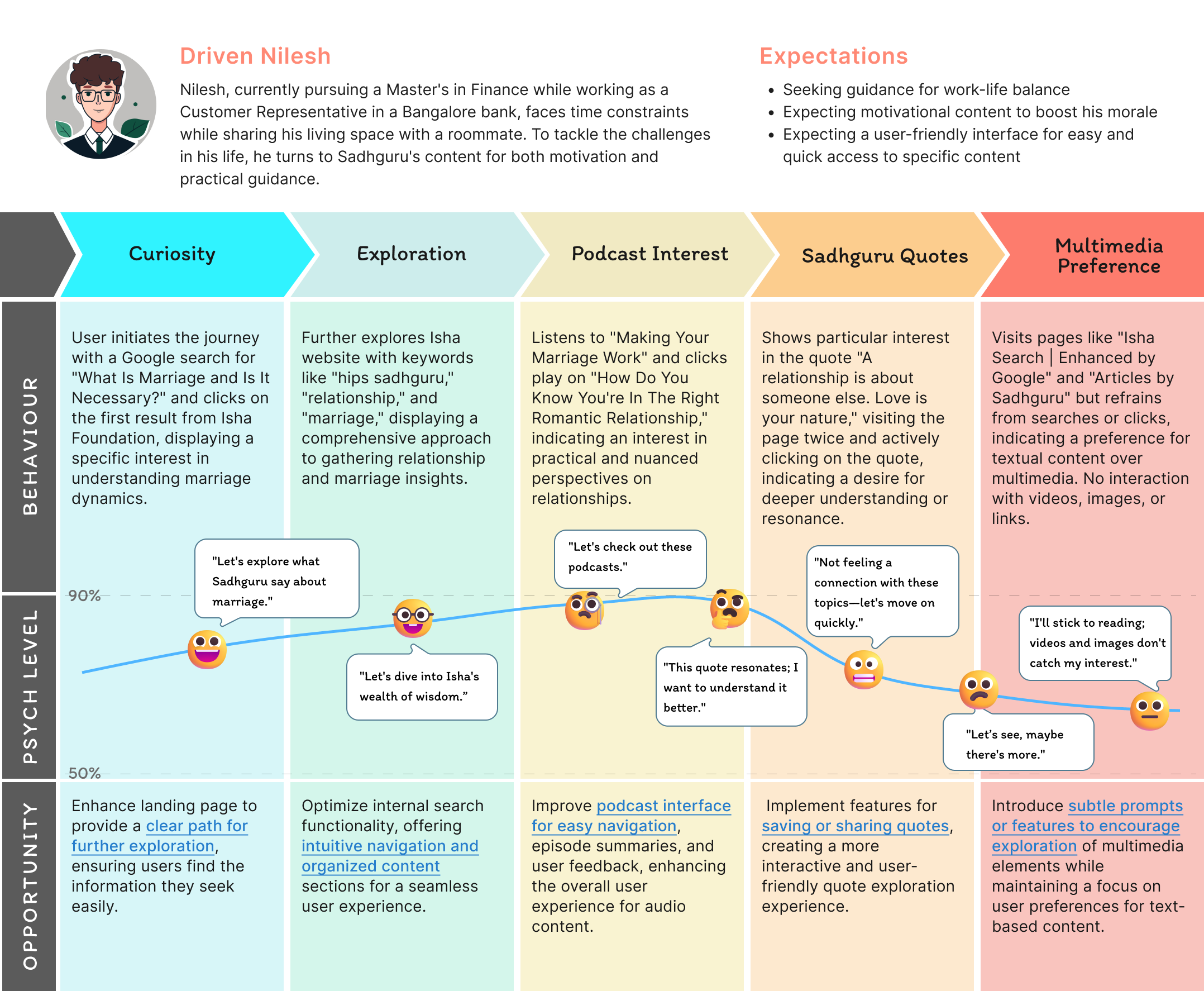

Persona - 1

Nilesh (M, 25) | Google Search
This reading-centric user prioritizes textual content for relationship insights on the Isha Foundation site. They prefer detailed written information and value streamlined, easily accessible content.
Kalpana (F, 32) | Site URL
This user deeply explores Sadhguru's quotes, intensely engaging with his teachings. Their exclusive focus on quotes highlights a specific, targeted interest in his wisdom.
Bhavesh (M, 39) | Social Media
This user thoroughly investigates Sadhguru's yoga and inner engineering content, persisting through tech challenges to embrace physical well-being, choosing Angamardana.
💡 Ideation & MVP
I then proceeded to analyze each possible user flow meticulously, aiming to identify both problems and opportunities at every turn and corner of the platform. At this point, I was having complete understanding of the problems with ISO wisdom.
Discoverability – Information Architecture & Navigations
The client's primary requirement is for users to effortlessly explore and navigate through the contents of the site. We began by drawing inspiration from the organization's app Information Architecture (IA), which divides the entire content into 12 distinct topics.
Engagement – Collections and New Features
During our user research, we discovered that the average active time users spent on Wisdom was only 2.4 minutes. To boost this engagement, we concentrated on specific content types, particularly collections, articles, videos, and quotes. Since collections were the focal point for user engagement in the mobile app, we aimed to replicate this structure on the website as well.
Conversion – Pool of Linked Components
The ultimate objective of the Wisdom section is to guide users towards registering for yoga programs or events, purchasing Isha products, or subscribing to Sadhguru Exclusive, among other conversion actions.
Retention – My Library
Approximately 70% of the daily users on Wisdom are new users, and one of our objectives was to encourage these users to revisit the platform. One approach to achieve this was to introduce user profiles. For guest users, we limit the number of items they can view in collections. Additionally, we are committed to delivering curated content lists tailored to each user's preferences. This customization is based on factors such as search and purchase history, followed topics, demographics, and more.
What I Learned?
Things that I inculcate in my design process:
- Organizing UX Data: Structured data analysis revealed user behaviors, guiding insights for intuitive design enhancements.
- Primary Noun Architecture: Utilized primary nouns for streamlined content organization, simplifying navigation and enhancing user experience.
- Quantitative Data's Value: Analyzing metrics provided actionable insights, aiding informed design decisions for user-centric solutions.

ISO - Research
Goal:
Tasked with enhancing engagement and driving conversions for the various yoga programs, products, and content available
Tool Used:
Figma, Google Analytics, Whimsical
Role:
UX Researcher
Timeline:
Sep 2023 - Jan 2024
About the Project
In 2016, ISO became the primary website for Isha Foundation, serving as a comprehensive platform to highlight the organization's offerings. Tasked with enhancing engagement and driving conversions for the various yoga programs, products, and content available, my focus was on the "Wisdom" section, which serves as the content hub of the parent site.
🔍 Problem with Current ISO Wisdom!
The current iteration of isha.sadhguru.org (ISO) was created to present a comprehensive display of all the offerings of the organization. It was designed with a straightforward approach, featuring linear information architecture, a non-hierarchical layout, and no prioritization due to a lack of supporting data.`
To start, I conducted a thorough UX audit of the entire ISO Wisdom platform. This involved analyzing the site's architecture, page layout, and identifying the factors influencing its low engagement. Delving into the quantitative data of the website provided a wealth of valuable insights.
Factors Resulting in
✔️ Over 90% of users exit after only reading the first article when arriving from Google Search.
✔️ Users face limited navigation options, including post-article navigation, easy content filtration, nudges, and access to metadata.
✔️ Content types such as blogs and popular topics like story-based or darker content suffer from poor discoverability.
Further Exploration with User Journey Mapping
Using quantitative data from MS Clarity, I discerned three distinct personas characterized by variations in age, referral sources, and needs. Leveraging user recordings, I delved deeper into understanding user behaviors and interactions with the platform.
Persona - 1
Nilesh (M, 25) | Google Search
This reading-centric user prioritizes textual content for relationship insights on the Isha Foundation site. They prefer detailed written information and value streamlined, easily accessible content.
Kalpana (F, 32) | Site URL
This user deeply explores Sadhguru's quotes, intensely engaging with his teachings. Their exclusive focus on quotes highlights a specific, targeted interest in his wisdom.
Bhavesh (M, 39) | Social Media
This user thoroughly investigates Sadhguru's yoga and inner engineering content, persisting through tech challenges to embrace physical well-being, choosing Angamardana.
💡 Ideation & MVP
I then proceeded to analyze each possible user flow meticulously, aiming to identify both problems and opportunities at every turn and corner of the platform. At this point, I was having complete understanding of the problems with ISO wisdom.
Discoverability – Information Architecture & Navigations
The client's primary requirement is for users to effortlessly explore and navigate through the contents of the site. We began by drawing inspiration from the organization's app Information Architecture (IA), which divides the entire content into 12 distinct topics.
Engagement – Collections and New Features
During our user research, we discovered that the average active time users spent on Wisdom was only 2.4 minutes. To boost this engagement, we concentrated on specific content types, particularly collections, articles, videos, and quotes. Since collections were the focal point for user engagement in the mobile app, we aimed to replicate this structure on the website as well.
Conversion – Pool of Linked Components
The ultimate objective of the Wisdom section is to guide users towards registering for yoga programs or events, purchasing Isha products, or subscribing to Sadhguru Exclusive, among other conversion actions.
Retention – My Library
Approximately 70% of the daily users on Wisdom are new users, and one of our objectives was to encourage these users to revisit the platform. One approach to achieve this was to introduce user profiles. For guest users, we limit the number of items they can view in collections. Additionally, we are committed to delivering curated content lists tailored to each user's preferences. This customization is based on factors such as search and purchase history, followed topics, demographics, and more.
What I Learned?
Things that I inculcate in my design process:
- Organizing UX Data: Structured data analysis revealed user behaviors, guiding insights for intuitive design enhancements.
- Primary Noun Architecture: Utilized primary nouns for streamlined content organization, simplifying navigation and enhancing user experience.
- Quantitative Data's Value: Analyzing metrics provided actionable insights, aiding informed design decisions for user-centric solutions.