
Usability Testing
Goal
Identify pain points and behavioral patterns in the end-to-end travel insurance purchase journey—from Homepage to Thank You page.
Role
8 moderated usability sessions (web + prototype)
Timeline
May–June 2025
🕵️♀️ Why This Usability Testing?
Before moving the design into development, I wanted to understand how real people experience the new journey of buying travel insurance online.
It’s not exactly the most exciting purchase — users aren’t browsing for fun, they’re often doing it last minute, under pressure, or with little context. So I ran a series of usability tests to explore where things break down, what confuses users, and how we can make the flow more human, intuitive, and actually helpful.
The goal? Spot friction, uncover assumptions, and turn all those “I didn’t notice that” moments into opportunities for better design. ✨
🔬 How I Ran the Research
To really understand how people interact with the travel insurance journey, I spoke to 6 users from different cities, backgrounds, and travel styles ✈️🧳.
Each session was one-on-one and pretty relaxed — users explored the website or prototype while thinking out loud 💬. I tracked their reactions across the full flow: from landing on the homepage, choosing a plan, filling out forms 📝, all the way to the final confirmation screen ✅.
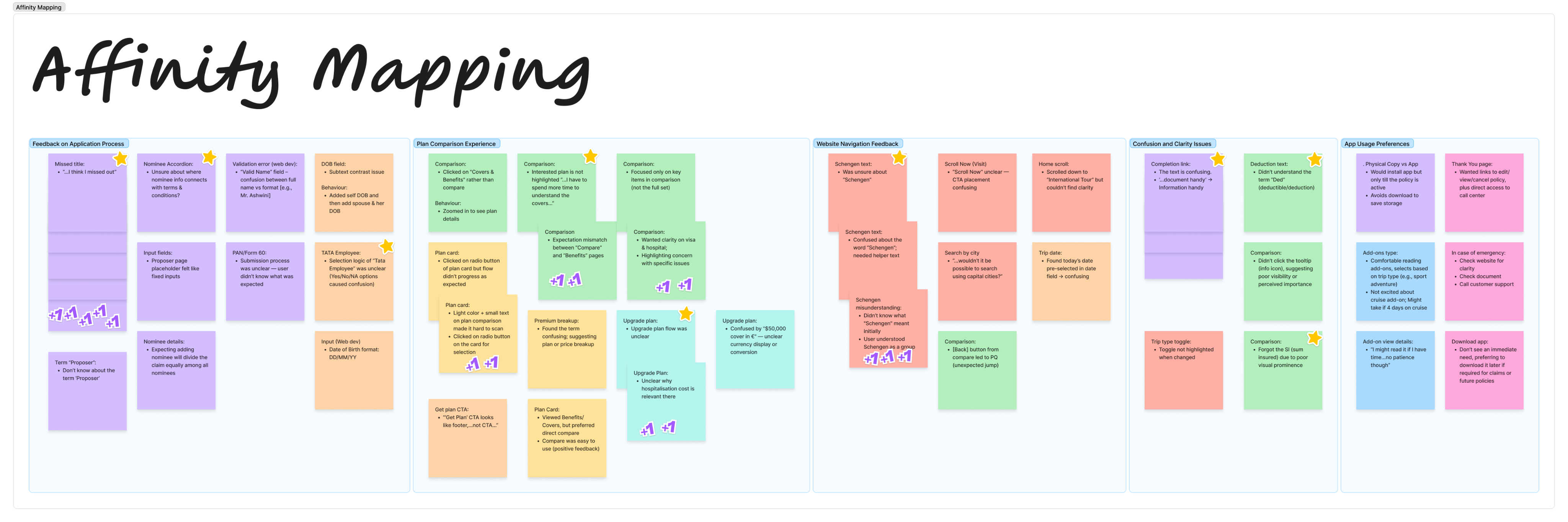
After gathering all the feedback, I sorted the notes by flow, grouped common patterns using affinity mapping, and turned those into insight cards that told us what wasn’t working, why it mattered, and what we could fix 🛠️.

🛠️ The Process

Visible in desktop mode
👥 Who I Spoke To
We spoke to 6 amazing people from across India—📍Mumbai, Delhi, Hyderabad, and Kolkata.
- Some were frequent flyers who travel internationally for work or leisure 🧳, while others took the occasional family trip within India 🏖️.
- A few had booked travel insurance before (mostly because it was mandatory for visas ✈️), but for most, this was unfamiliar territory. Some relied on cousins or travel agents to handle the planning, while others were hands-on DIY planners 📅.
- Their tech comfort levels ranged from casual mobile users to savvy online bookers—no one was a total newbie, but not everyone read the fine print either 😅.
This mix gave us a well-rounded view of how real users think, skip, scroll, and sometimes miss the obvious when navigating travel insurance.
🔍 Thematic Analysis
After mapping out user feedback, we identified 5 core friction areas that shaped our redesign decisions:
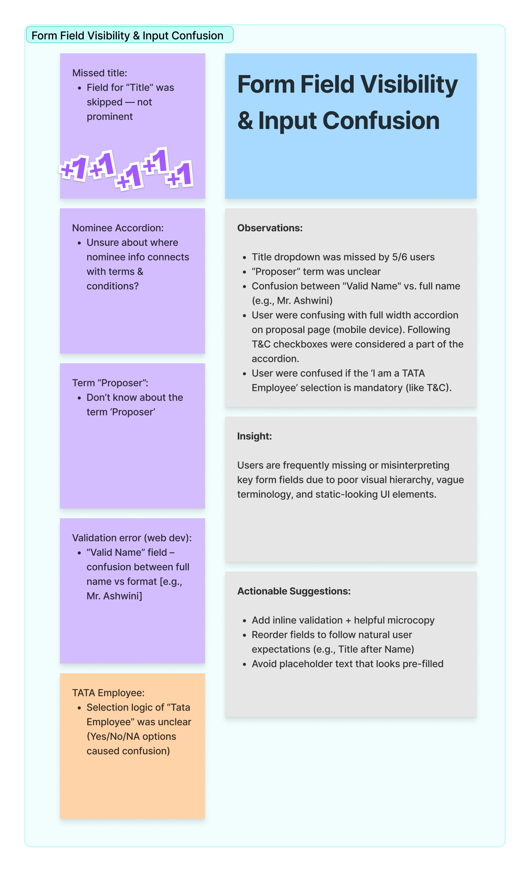
- 🧾 Form Field Visibility & Input Confusion: Users skipped key fields due to unclear labels, vague terms (like "Proposer"), or poorly structured input layouts — especially on mobile.
- 📊 Plan Comparison & Upgrade Complexity: Users struggled to differentiate plans due to similar-looking cards and unclear upgrade logic. They didn’t always understand why an upgrade was offered.
- 🧭 Website Navigation Confusion: Misunderstood terms like “Schengen” and hidden CTAs (e.g., “Scroll Now”) caused users to miss critical actions, especially with auto-filled or defaulted data fields.
- ❓ Clarity & Confirmation Gaps: Gaps in tooltips, toggles, and unclear summary elements left users second-guessing coverage decisions and caused missed confirmations.
- 🔒 User Preferences & Trust Behavior: Users preferred downloading docs later and showed resistance to installing apps unless absolutely needed. They valued quick access to policy info and support options.
These themes helped us shape targeted improvements to make the experience clearer, smarter, and more reassuring for users on the go ✈️💡.
💡 Key Design Decisions from Usability Testing
Based on user feedback, I proposed 5 major improvements to boost clarity, trust, and ease of use:
- 🧾 Clearer Fields & Labels: Replaced jargon (like Proposer) with simpler terms and added tooltips/microcopy for better input guidance.
- 📊 Smarter Plan Comparison: Introduced badges (✔️ Basic, ⭐ Smart) and inline “Why this upgrade?” hints to help users choose confidently.
- 🧭 Better Navigation: Reworded confusing terms (e.g., Schengen), fixed misguiding CTAs, and confirmed pre-filled details visibly.
- ❓Simplified Toggles: Redesigned toggles with clear labels and visual feedback to avoid confusion during plan selection.
- 🔒 Trust & Control: Enabled actions like document download without login, added “Save for later” options, and displayed support upfront.
Insight Card
Impact & Next Steps
✅ What Changed Immediately
Fixed key issues like missed fields, confusing comparisons, and unclear submission feedback. Shared with the team and prioritized as quick design wins 🛠️
🌟 What Sparked New Ideas
Discovered opportunities for smart upgrades, contextual nudges, and better plan clarity. These sparked deeper conversations with product and dev teams 💬✨
🔮 What’s Coming Next
Planning A/B testing for improved flows and including more diverse users like first-timers and senior travelers to ensure inclusivity 👵✈️
Chandra Kumar Deo
Usability Testing
Goal:
Identify pain points and behavioral patterns in the end-to-end travel insurance purchase journey—from Homepage to Thank You page.
Scope:
8 moderated usability sessions (web + prototype)
Timeline:
May–June 2025
🕵️♀️ Why This Usability Testing?
Before moving the design into development, I wanted to understand how real people experience the new journey of buying travel insurance online.
It’s not exactly the most exciting purchase — users aren’t browsing for fun, they’re often doing it last minute, under pressure, or with little context. So I ran a series of usability tests to explore where things break down, what confuses users, and how we can make the flow more human, intuitive, and actually helpful.
The goal? Spot friction, uncover assumptions, and turn all those “I didn’t notice that” moments into opportunities for better design. ✨
🔬 How I Ran the Research
To really understand how people interact with the travel insurance journey, I spoke to 6 users from different cities, backgrounds, and travel styles ✈️🧳.
Each session was one-on-one and pretty relaxed — users explored the website or prototype while thinking out loud 💬. I tracked their reactions across the full flow: from landing on the homepage, choosing a plan, filling out forms 📝, all the way to the final confirmation screen ✅.
After gathering all the feedback, I sorted the notes by flow, grouped common patterns using affinity mapping, and turned those into insight cards that told us what wasn’t working, why it mattered, and what we could fix 🛠️.
🛠️ The Process


Preparation

- Defined testing goals based on live product gaps
- Created flow-wise questions banks tailored to user types (e.g., adventure travellers, family planners)
- Designed responsive prototypes and checked for device adaptability (some buttons hid on iPhones 📱—not ideal!)
- Reached out to 8 participants from 4 major cities
- Mixed backgrounds: business travelers, leisure tourists, first-time insurance buyers
- Ensured a balance of digital comfort levels—some used apps regularly, others preferred downloading PDFs
- Conducted one-on-one sessions using a think-aloud method
- Encouraged users to navigate freely and express thoughts naturally
- Asked contextual questions (e.g., “Would you click this if you were booking for your parents?”)
- Logged observations based on key journey stages: Homepage, Pre-Quote, Quote, Compare, Add-ons, Completion
- Captured micro-frictions like confusion over “Schengen” and macro gaps like trust signals missing
- Grouped sticky notes into visual clusters in FigJam
- Identified five clear experience themes across interviews
- Converted patterns into insight cards with actionable fixes
👥 Who I Spoke To
We spoke to 6 amazing people from across India—📍Mumbai, Delhi, Hyderabad, and Kolkata.
- Some were frequent flyers who travel internationally for work or leisure 🧳, while others took the occasional family trip within India 🏖️.
- A few had booked travel insurance before (mostly because it was mandatory for visas ✈️), but for most, this was unfamiliar territory. Some relied on cousins or travel agents to handle the planning, while others were hands-on DIY planners 📅.
- Their tech comfort levels ranged from casual mobile users to savvy online bookers—no one was a total newbie, but not everyone read the fine print either 😅.
This mix gave us a well-rounded view of how real users think, skip, scroll, and sometimes miss the obvious when navigating travel insurance.
🔍 Thematic Analysis
After mapping out user feedback, we identified 5 core friction areas that shaped our redesign decisions:
- 🧾 Form Field Visibility & Input Confusion: Users skipped key fields due to unclear labels, vague terms (like "Proposer"), or poorly structured input layouts — especially on mobile.
- 📊 Plan Comparison & Upgrade Complexity: Users struggled to differentiate plans due to similar-looking cards and unclear upgrade logic. They didn’t always understand why an upgrade was offered.
- 🧭 Website Navigation Confusion: Misunderstood terms like “Schengen” and hidden CTAs (e.g., “Scroll Now”) caused users to miss critical actions, especially with auto-filled or defaulted data fields.
- ❓ Clarity & Confirmation Gaps: Gaps in tooltips, toggles, and unclear summary elements left users second-guessing coverage decisions and caused missed confirmations.
- 🔒 User Preferences & Trust Behavior: Users preferred downloading docs later and showed resistance to installing apps unless absolutely needed. They valued quick access to policy info and support options.
These themes helped us shape targeted improvements to make the experience clearer, smarter, and more reassuring for users on the go ✈️💡.
💡 Key Design Decisions from Usability Testing
Based on user feedback, I proposed 5 major improvements to boost clarity, trust, and ease of use:
- 🧾 Clearer Fields & Labels: Replaced jargon (like Proposer) with simpler terms and added tooltips/microcopy for better input guidance.
- 📊 Smarter Plan Comparison: Introduced badges (✔️ Basic, ⭐ Smart) and inline “Why this upgrade?” hints to help users choose confidently.
- 🧭 Better Navigation: Reworded confusing terms (e.g., Schengen), fixed misguiding CTAs, and confirmed pre-filled details visibly.
- ❓Simplified Toggles: Redesigned toggles with clear labels and visual feedback to avoid confusion during plan selection.
- 🔒 Trust & Control: Enabled actions like document download without login, added “Save for later” options, and displayed support upfront.
Insight Card
Impact & Next Steps
✅ What Changed Immediately
Fixed key issues like missed fields, confusing comparisons, and unclear submission feedback. Shared with the team and prioritized as quick design wins 🛠️
🌟 What Sparked New Ideas
Discovered opportunities for smart upgrades, contextual nudges, and better plan clarity. These sparked deeper conversations with product and dev teams 💬✨
🔮 What’s Coming Next
Planning A/B testing for improved flows and including more diverse users like first-timers and senior travelers to ensure inclusivity 👵✈️

Usability Testing
Goal:
Identify pain points and behavioural patterns in the end-to-end travel insurance purchase journey—from Homepage to Thank You page.
Scope:
8 moderated usability sessions (web + prototype)
Timeline:
May–June 2025
🕵️♀️ Why This Usability Testing?
Before moving the design into development, I wanted to understand how real people experience the new journey of buying travel insurance online.
It’s not exactly the most exciting purchase — users aren’t browsing for fun, they’re often doing it last minute, under pressure, or with little context. So I ran a series of usability tests to explore where things break down, what confuses users, and how we can make the flow more human, intuitive, and actually helpful.
The goal? Spot friction, uncover assumptions, and turn all those “I didn’t notice that” moments into opportunities for better design. ✨
🔬 How I Ran the Research
To really understand how people interact with the travel insurance journey, I spoke to 6 users from different cities, backgrounds, and travel styles ✈️🧳.
Each session was one-on-one and pretty relaxed — users explored the website or prototype while thinking out loud 💬. I tracked their reactions across the full flow: from landing on the homepage, choosing a plan, filling out forms 📝, all the way to the final confirmation screen ✅.
After gathering all the feedback, I sorted the notes by flow, grouped common patterns using affinity mapping, and turned those into insight cards that told us what wasn’t working, why it mattered, and what we could fix 🛠️.
🛠️ The Process
Preparation
- Defined testing goals based on live product gaps
- Created flow-wise questions banks tailored to user types (e.g., adventure travellers, family planners)
- Designed responsive prototypes and checked for device adaptability (some buttons hid on iPhones 📱—not ideal!)
- Reached out to 8 participants from 4 major cities
- Mixed backgrounds: business travelers, leisure tourists, first-time insurance buyers
- Ensured a balance of digital comfort levels—some used apps regularly, others preferred downloading PDFs
- Conducted one-on-one sessions using a think-aloud method
- Encouraged users to navigate freely and express thoughts naturally
- Asked contextual questions (e.g., “Would you click this if you were booking for your parents?”)
- Logged observations based on key journey stages: Homepage, Pre-Quote, Quote, Compare, Add-ons, Completion
- Captured micro-frictions like confusion over “Schengen” and macro gaps like trust signals missing
- Grouped sticky notes into visual clusters in FigJam
- Identified five clear experience themes across interviews
- Converted patterns into insight cards with actionable fixes
👥 Who I Spoke To
We spoke to 6 amazing people from across India—📍Mumbai, Delhi, Hyderabad, and Kolkata.
- Some were frequent flyers who travel internationally for work or leisure 🧳, while others took the occasional family trip within India 🏖️.
- A few had booked travel insurance before (mostly because it was mandatory for visas ✈️), but for most, this was unfamiliar territory. Some relied on cousins or travel agents to handle the planning, while others were hands-on DIY planners 📅.
- Their tech comfort levels ranged from casual mobile users to savvy online bookers—no one was a total newbie, but not everyone read the fine print either 😅.
This mix gave us a well-rounded view of how real users think, skip, scroll, and sometimes miss the obvious when navigating travel insurance.
🔍 Thematic Analysis
After mapping out user feedback, we identified 5 core friction areas that shaped our redesign decisions:
- 🧾 Form Field Visibility & Input Confusion: Users skipped key fields due to unclear labels, vague terms (like "Proposer"), or poorly structured input layouts — especially on mobile.
- 📊 Plan Comparison & Upgrade Complexity: Users struggled to differentiate plans due to similar-looking cards and unclear upgrade logic. They didn’t always understand why an upgrade was offered.
- 🧭 Website Navigation Confusion: Misunderstood terms like “Schengen” and hidden CTAs (e.g., “Scroll Now”) caused users to miss critical actions, especially with auto-filled or defaulted data fields.
- ❓ Clarity & Confirmation Gaps: Gaps in tooltips, toggles, and unclear summary elements left users second-guessing coverage decisions and caused missed confirmations.
- 🔒 User Preferences & Trust Behavior: Users preferred downloading docs later and showed resistance to installing apps unless absolutely needed. They valued quick access to policy info and support options.
These themes helped us shape targeted improvements to make the experience clearer, smarter, and more reassuring for users on the go ✈️💡.
💡 Key Design Decisions from Usability Testing
Based on user feedback, I proposed 5 major improvements to boost clarity, trust, and ease of use:
- 🧾 Clearer Fields & Labels: Replaced jargon (like Proposer) with simpler terms and added tooltips/microcopy for better input guidance.
- 📊 Smarter Plan Comparison: Introduced badges (✔️ Basic, ⭐ Smart) and inline “Why this upgrade?” hints to help users choose confidently.
- 🧭 Better Navigation: Reworded confusing terms (e.g., Schengen), fixed misguiding CTAs, and confirmed pre-filled details visibly.
- ❓Simplified Toggles: Redesigned toggles with clear labels and visual feedback to avoid confusion during plan selection.
- 🔒 Trust & Control: Enabled actions like document download without login, added “Save for later” options, and displayed support upfront.
Insight Card
Impact & Next Steps
✅ What Changed Immediately
Fixed key issues like missed fields, confusing comparisons, and unclear submission feedback. Shared with the team and prioritized as quick design wins 🛠️
🌟 What Sparked New Ideas
Discovered opportunities for smart upgrades, contextual nudges, and better plan clarity. These sparked deeper conversations with product and dev teams 💬✨
🔮 What’s Coming Next
Planning A/B testing for improved flows and including more diverse users like first-timers and senior travelers to ensure inclusivity 👵✈️